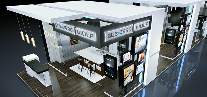
When you purchase exhibit space at a trade show, you’re essentially buying the opportunity to not only strengthen your brand but also move prospects along the sales cycle. Your ability to succeed in these two areas is often tied to the design of your space.
For this reason, exhibit space design should never be an afterthought. It should be approached holistically, while considering these four insights:
1. “Your exhibit isn’t architecture. It’s a story.”
Gone are the days when visual impact was the only thing that mattered. Today’s consumers need to be engaged. They need a compelling story. In the B2B world this is especially important. If you’re operating in this space, you need to explain how your product is better, faster and more compatible—and how it will increase shareholder value.
Yes, this is a tall order, but good design can make it happen.
Good design considers what visitors to your exhibit will see first. It takes advantage of where the eye may linger or rest. It considers the flow of the experience, or how your customers will digest your story.

As a sponsor to NFL events, including the Super Bowl, Sleep Number’s exhibit included football helmet-shaped structures surrounding their beds.
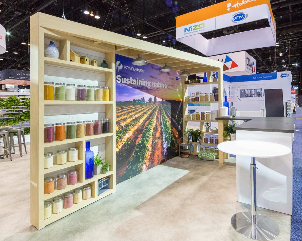
Woodgrain shelving, a mural of farm fields, and plants in their exhibit help communicate Tastepoint’s commitment to sustainability.
2. “Technology is your friend.”
Good design takes advantage of technology to tell your story. And thankfully, the cost of using technology has declined despite its advances.
Today, there’s so much you can do with digital media to project images and content throughout your exhibit, from using LED tiles to create a living skin to syncing up large-scale monitors to display a powerful image. It’s relatively easy and inexpensive to create a wall of colorful imagery or eye-catching animation. The possibilities are delightfully endless, and more affordable than ever before.

An embedded video wall helps Sick Sensors tell their story with impact and motion. Smaller flatscreen monitors attached to individual products tell their specific stories.
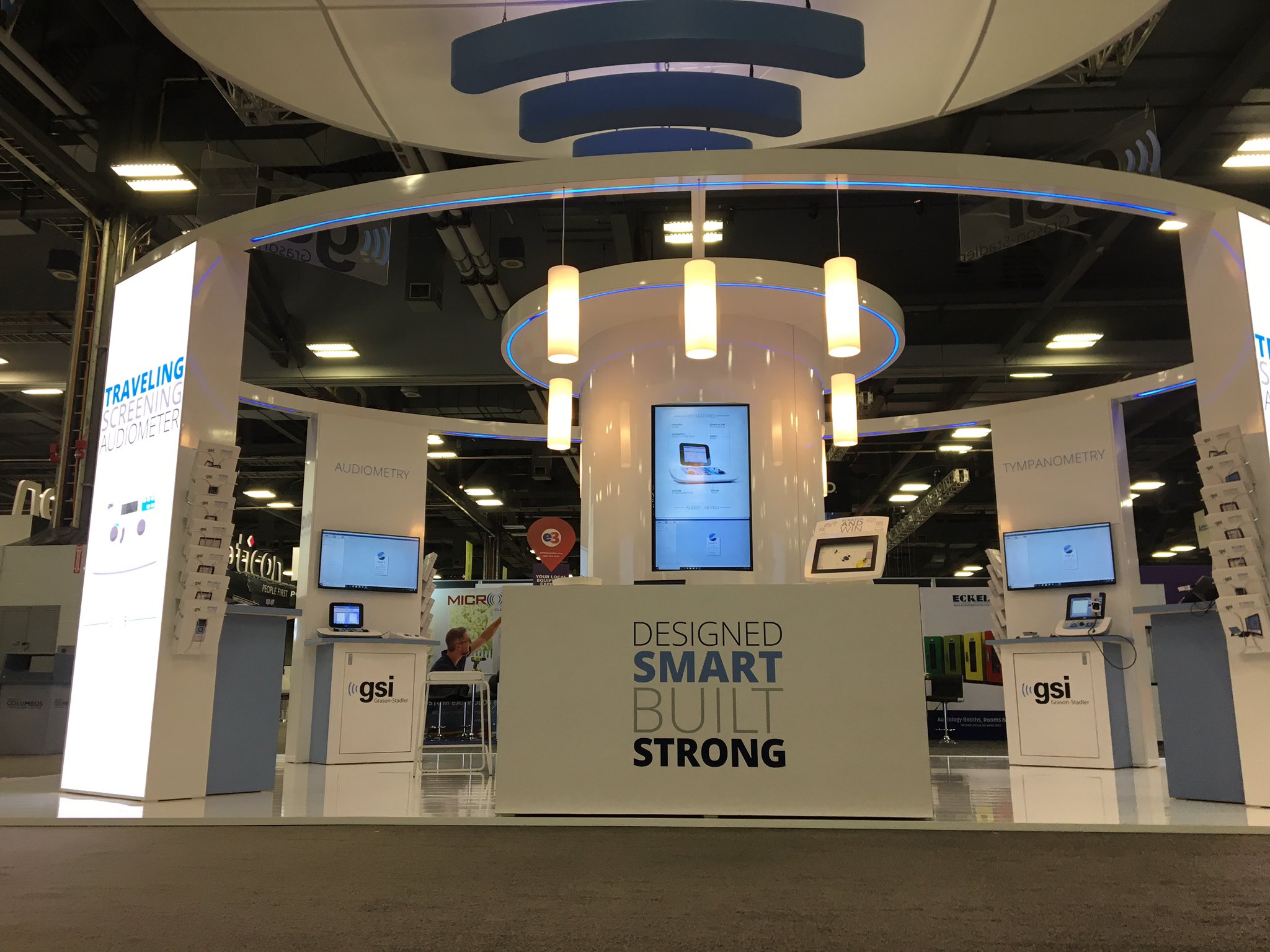
Grayson-Stadler boosts attraction and engagement with four video walls on the corners of the booth perimeter, and multiple monitors for storytelling and demo support on the inside.
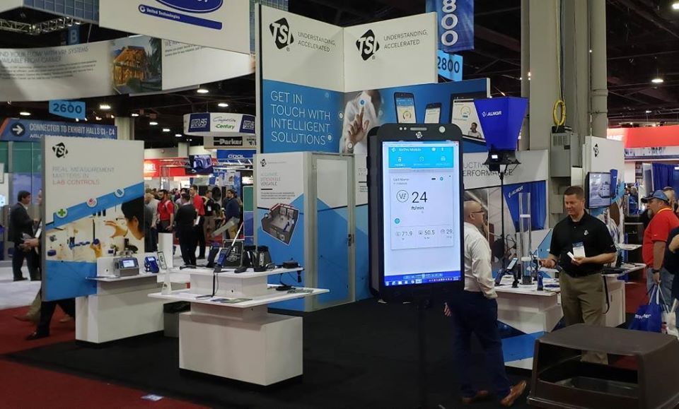
The TSI exhibit includes a flat screen monitor displayed like an oversized smart phone, demonstrating how customers can get data reports anywhere they carry their phone.
3. “Every surface is an opportunity.”
Remember that in most cases, when you purchase an exhibit space you not only have the rights to the floor but also the space above it. Think in three dimensions, and take the opportunity to make a stunning impact. You’re limited only by budget and imagination.
Good design considers every surface—at every dimension—to make this happen. It thinks about image, light and message, as well as how these elements interact with each other. It recognizes that everything your customers experience at your exhibit is a chance to tell your story.
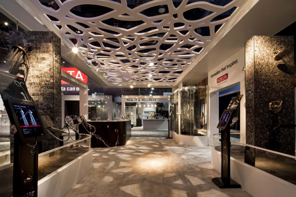
This imaginative, open ceiling structure not only creates visual intrigue and better defines Delta’s booth space, its shadows also create an interesting pattern on the exhibit floor.

Booth visitors experience a strong Uponor brand impression via their logo on the often-overlooked underside of their hanging sign.
4. “Don’t neglect your purpose.”
In every aspect of exhibit space design, it’s important to think about your purpose—i.e., the reason you decided to attend the show in the first place. Good design continually revisits your goals for the show to make sure it’s meeting each one. In other words, good design is mindful.
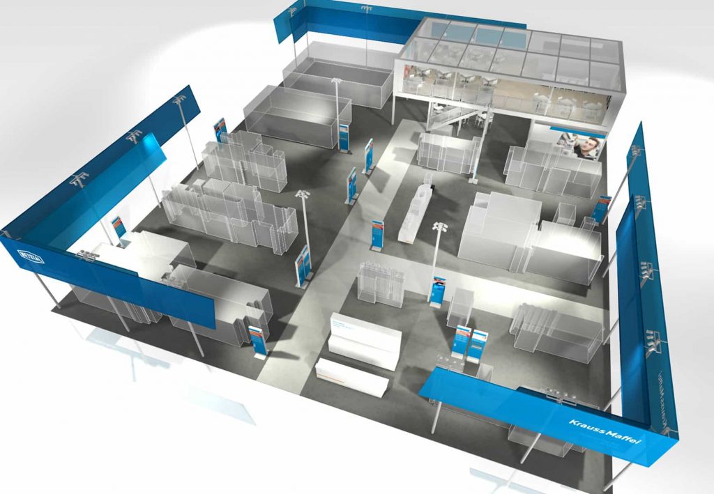
Krauss-Maffei dedicated almost all of their 120 x 100 foot exhibit to fulfill two goals: Demonstrate their products and hold VIP meetings to strengthen key relationships.
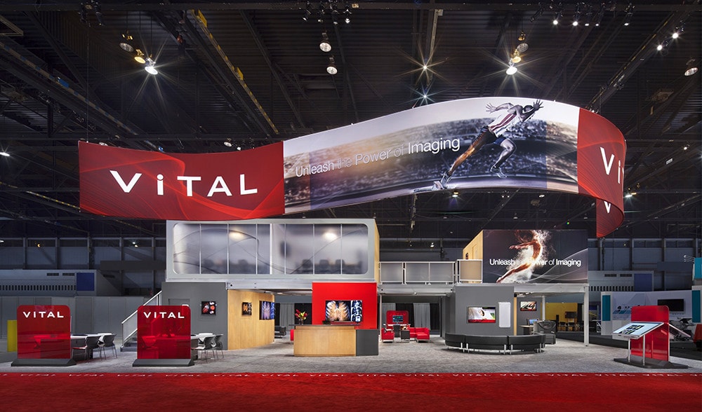
Vital’s large island exhibit has a wide variety of meeting spaces spread around their booth, plus features large, bold graphics for strong brand building.
Keep these insights of successful exhibit space design in mind, and your customers will likely keep you in mind, too

